Zola Guest List
Improving the guest list onboarding experience to educate users about our value props and simplify activation.
My Role: Product Designer, Researcher (2021)
Additional Team Members: Product Manager, Engineering Lead, 1 Engineer
Timing: 2 weeks design & research, 3 weeks engineering
Business opportunity
Only ~7% of guest list users currently had 5+ guests on their guest list.
As one of our earliest funnel products with clear ties into our revenue generating products, we see that Guest List users have the highest lifetime value at Zola. In mid-2019, about 27% of Zola couples had activated the Guest List product.
User needs and problems
The user group we focused on were couples who are signing up with Zola as “guest list first” users, as well as those who activate guest list from other products. A round of usability testing showed the current onboarding experience provided no personalization, which couples expected based on the questions. Once users were in, they were underwhelmed and unsure of where to go or what to do next.
Analyzing the current experience
Current guest list experience
👎
The onboarding questions had no impact on the experience
👎
The empty state didn’t prompt users to take the action previously selected
👎
The walkthrough UI was off brand and sterile
UX guiding principles
We had very little flexibility (or time) to make adjustments to the page itself. Editing existing elements would be difficult. We decided to take a lens of “adding and removing” instead. The following design principles were created to ground the team given the tight timeline of 2 weeks to come up with the final solution.
✅
Clearly communicate value to the user
✅
Let the visuals do the hard work
Research and findings
Concept 1: Add guests within the onboarding flow
How might we allow our couples to start their guest list as quickly as possible?
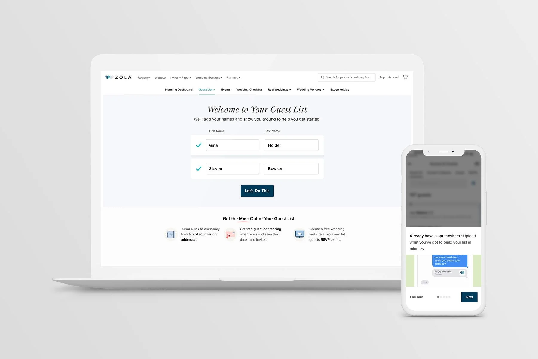
Concept 2 Add yourself and your partner during onboarding
How might we ease couples into beginning their guest list so they don’t feel overwhelmed?