Citi - Commercial Banking
Reimagining the CitiBusiness Online digital customer experience to achieve a better UX, a modern user interface, and re-worked information architecture
My Role: Product Design and Research Lead
Additional Team Members: Scrum Master, Business Analyst, Junior UXD, UX Researcher
Problem
CitiBusiness Online was “designed” by a team of developers back in the late 90s and had never been looked at from a UI nor UX perspective since. The primary user complaint was there were too many clicks to perform a simple task. Given that the outdated interface acted more as how one might look at a sitemap, there were multiple opportunities for improvement through updated the navigation and making way-finding easier. Citi was losing potential customers due to the dated interface, and sales wouldn’t even use a demo of the product when selling because it was a deterrent to prospects in the past.

Original design of CitiBusiness online
Process
Our team was brought in to not only bring an updated UI, but for the first time incorporate human centered design practices into the product’s life. Because most of the features were just added on as additional links when they were created, we began interviewing their customers to identify the most common workflows, product personas, and Jobs to Be Done within the site. Using that feedback, we facilitated a 2 day innovation session with Citi to take a look at the feedback and see - given technical and legal restraints - where we were able to make improvements with clicks and information hierarchy.
The photos below are shots from an interactive journey mapping session we ran with smaller groups of stakeholders, and myself presenting a deck of UX trends to not only educate the group (who was fairly new to design thinking) on where the industry currently was, but the ways in which we were hoping to leverage Citi’s brand and trust with their clients to push their UX beyond the competition.
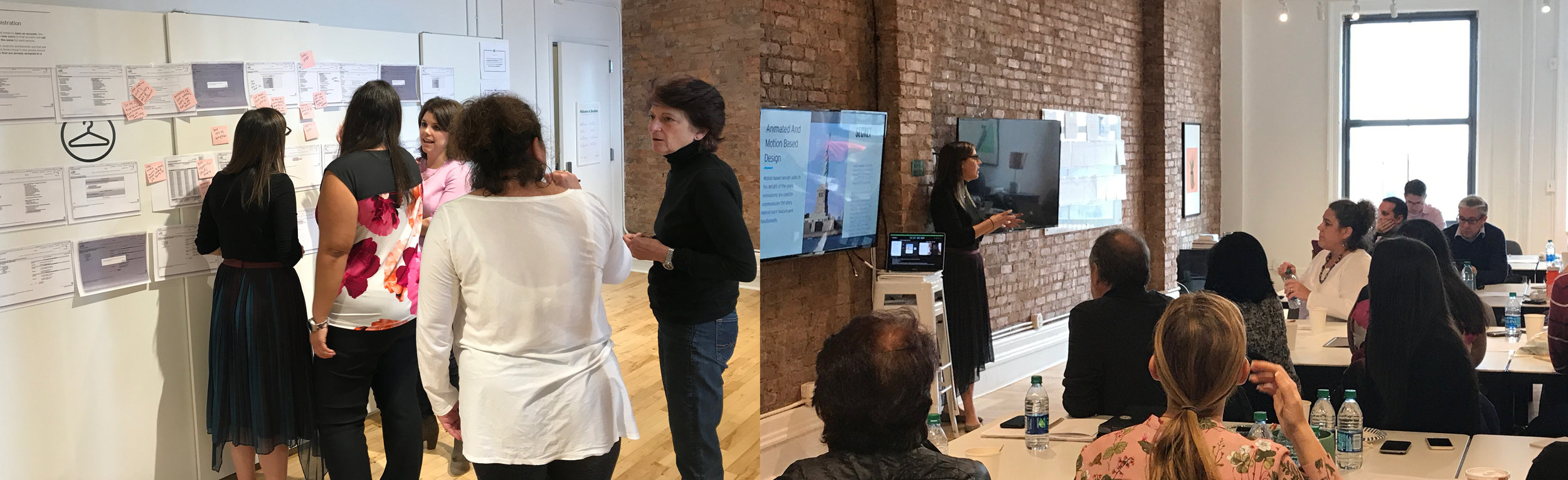
Shots from our Innovation Session

Product-based personas resulting from user interviews
Initial designs from the sessions were used to begin the first of about 8, 3-week sprints, using continued validation and iterative design to evolve the interface. Each additional feature was groomed, wireframed, prototyped, tested with Citi users, iterated, and brought into high fidelity every sprint, producing the Phase 1 release of the product.
My role specifically was creating the user experience and UI designs of each feature. I also partnered with our researcher to take notes during interviews, distill findings into actionable design changes, and communicating the updates in design to our stakeholder team. I also partnered with our junior designer to collaborate on design work, meeting frequently to give feedback and help present the work to our clients.
Given the nature of consulting work with large enterprises, my role often was evangelizing and advocating for thoughtful UX practices. Citi was just becoming familiar with agile, and the reality of what implementing UX processes to product development was generally new to most. On a daily basis that meant fighting for proper timelines to get things done, not skipping user research, and using articles/data of UX best practices to justify design decision made.
Solution
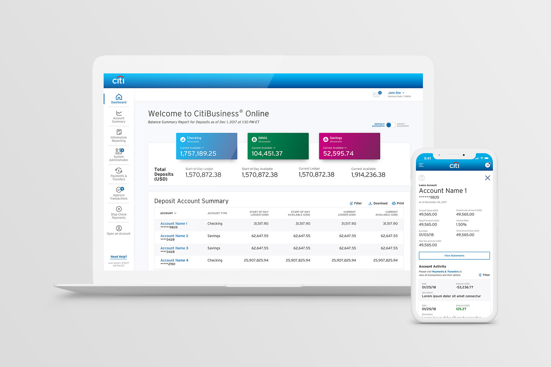
The result was a fully responsive and ADA (AA) compliant website to be released in a phased approach to a group of friendly beta testers. The feature set developed was applicable to an overwhelming majority of users, and click reduction was anywhere from 25%-80%, depending on the feature.

Outcome
Toward the end of phase 1, validation for the refined features were met with a great deal of positive validation!
“Looks good, clear. Similar to Bank of America but better.”
“I like the sidebar with the quick links (navigation). It took me a while to find it on the existing system so to have the tasks you normally do more often be there on the side, I really like that. I think it looks great.”
[On the contextual action buttons across the site] “Oh I like that! It’s easy, you’re right there. You don’t have to go out of the screen to go to another screen to make a payment, it’ll take you right there.”
The redesign was launched around March 2019 after our engagement was finished.